|

|
100.
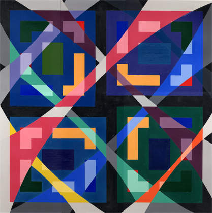
Title: No Room To Move
Media: Original painting in Designer's Gouache on Strathmore illustration board
Size: 27 in. x 27.75 in.
Original's Price: $1,235
Original Available (y/n): [Yes]
Available Format(s): Original Piece, Matted Prints, Note Cards
Price(s): $1,235, $85, $5.25 ea respectively
Year of Completion: 1996
Catalog No.: 96-1
Purchase Information: Contact the artist.
|
I had not painted for several months prior to beginning "No Room To Move." And for this reason, as in the past, I felt much more
comfortable designing something with a repetitive pattern. There was "comfort" and "balance" in the arrangement of shapes -- or at
least this was my intent. I say this only because I must also admit my "discomfort" with this painting. And without going into any
detail, I will only say the painting was done at a time in my own life where I felt most "stuck." It was not until much later
(after 1996) when it felt more comfortable to move away from images which looked and felt somewhat "ridged." Possibly these are
somewhat negative or biased interpretations.

On a lighter side, it was my intent at this time to see what an arrangement of six (6) shapes looked like when placed together in
a way that satisfied three (3) requirements: Those requirements were:

a) They would need to have a width of exactly 1 inch

b) They would need to be arranged EQUALLY AS FAR APART from one another as this and

c) they would each have to be unique in shape WHILE AT THE SAME TIME fitting into a square "format" very close to a 8" x 9"
dimension (7 7/8" x 8 7/8" to be exact).

I was intrigued by this design challenge since it would require some thought in two related areas. How could the these shapes be
entirely different from one another while still "fitting" into the nearly square rectangle AND what would such a design look like
if it was replicated 3 more times so that a total of 4 identical "design composites" coexisted IN A LARGER PEFECT SQUARE?

Part of the solution was to rotate each sub-design 90 degrees to the left (when "moving" in a counter-clockwise direction). The
other part of the solution was to arbitrarily "pick" different lengths for each "bar". The center-most area of each sub design is
somewhat unique in that it is NOT 1" in dimension. It is "closed in on itself" and APPEARS not to satisfy the 1" rule. If one
considers this "closed in" aspect then the 1" rule can still be satisfied. Finally, as with most abstract geometric designs, I was
curious what this overall design would look like if an entirely DIFFERENT (and freehand) design was superimposed over the
previously described design. This appears as a 4 X 4 banded web-like, diagonal grid system. It was THIS that enabled me to "break
the design up" into areas which helped facilitate a color scheme.

The color scheme has the following aspects:

1) Areas not involving the 4 sub-designs are to be considered the background. They are BLACK.

2) Each "WEB" grid-band must appear to lie OVER or UNDER another (or several) bands. Note: There is no predictable pattern to this
arrangement and is admittedly arbitrarily chosen (to be OVER or UNDER) neighboring bands based on a "rough rule" of "darker color
bands looking better UNDER lighter color bands.

3) Each web band must have its own unique color scheme AND their hues (red or aqua or yellow, or purple for example) must
influence what happens UNDERNEATH the band in the following way:

a) The hue must be A SHADE OF THE HUE if it is influencing an area that does NOT involve the unique 1" shapes in the 4 large
squares; ie., the square itself.

b) The hue must be A TINT OF THE HUE if it is influencing an area that DOES involve the unique 1" shapes in the 4 large squares;
ie., the 1" bars themselves.

c) The hue must be A TINT OF BLACK (grey) if it intersects a "background-only" AND these tints of grey must EACH be different in
intensity since these grey areas DO in some cases intersect one another and need to be differentiated.

d) The CHOICE of colors for the web-bands must be arbitrarily chosen FROM the colors found in the sub-designs over which they lie
(and vise versa).

e) The ORIENTATION of the 4 sub-designs must (as in most of my GEOMETRIC designs) have their STRONGEST colors CENTRALLY located --
in this case the YELLOW areas.

This pretty much describes "No Room To Move." There is symmetry and balance. And there is some sense of confinement, at least for
me. It is hoped the design itself is viewed APART FROM the confining aspects, since it is a more comfortable feeling to have more
room in which to move in life.

Back
|