|

|
160.
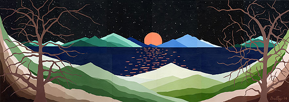
Title: Solitude in Moonlight
Media: Original painting in Designer's Gouache on Fabriano Museum Board
Size: 56 3/4 in. x 25 1/2 in.
Original's Price: $1,400
Original(s) Available (y/n): [Yes]
Available Formats: Original Painting and Matted prints
Size (matted): 10.9" x 5.8" (can be adjusted)
Price (matted): $85
Year of Completion: 2004
Catalog No.: 04G27-1
Purchase Information:
Contact the artist
|
Artist's Notes ...

The image is a peaceful scene of a long lake with gradated mountains in both
the foreground and in the distance at the horizon's edge running the entire
length of the piece.  There is a full moon in the center of the most distant
mountain range rising up from a valley.  There is a new feature never used of
a glistening reflection of the moon's light in the center of the painting on
the water's surface -- much like white caps -- tiny ones -- on the surface of
the ocean.  There is a feeling of stillness in the piece.  No wind at all.
There is a large expanse of black sky filled with many stars.  The last main
feature is the presence of two large winter trees with extensive branching
both to the left and the right of the moon.  Their branching incorporates
about 60% of the scene.  The colors are at this point intended to fit those
in your dining room [this is a commissioned piece] -- focusing mainly on
mountains in gradations of sepia interspersed with gradations of sap green
(toned down quite a bit).  The moon will be as it appears in the sky normally
-- mostly a whitish-yellow.  The lake I am thinking may need to be Prussian
blue or maybe indigo -- possibly with a reflection of stars.  The mountains
rise up at both the left and right sides of the piece giving the overall
impression that the entire scene is within a peaceful valley.  Finally, the
glistening reflections in lake are done in perspective to give a further
feeling of distance.

A preliminary title for the piece is "Solitude in Moonlight."

The wood molding selection (with glass) has not yet been decided -- possibly
something dark and contemporary to go with the sky (and room).

March 8th Comments

The above image shows the work in progress and represents a multiple scan of
the actual piece.  The 14 scanned images which make up the entire painting
are not consistent in contrast and/or brightness.  They do nevertheless give
some idea of the overall scene.  The process of combining these separate
images was accomplished by resizing, cropping, cutting and pasting the
scanned images into one separate image file.  Adobe Photoshop was used to
accomplish this.  The process took about 4 hours.

July 27th Comments

Finally, I can now say "Solitude in Moonlight" is completed!  Some changes
were made to the original plans for the painting (previously mentioned).  My
first thought for the moon's color was along the lines of something bright
and not unusual -- something fairly realistic.  But as the warmth in the
painting began to become more evident (with the addition of alizarine crimson
to the sepia-colored trees to make them less "gray") I chose to CORRECT what
seemed to be a poor color (and phase) choice in the moon.  And although I had
written that a whitish-yellow color would have looked best, I incorrectly
used a light gray for about 7/8's of the moons (then unlighted) side.  My
interest in portraying the earlier mentioned condition called "Earthshine"
seemed not to work at all for the piece.  It necessitated the water
reflections to be gray and rather uninteresting.  They did not evoke a
positive message and I had become more interested in this.  And so I changed
the thin crescent of a moon with its grayish dark side to a FULL moon with
more warmth and vibrancy in both itself and its reflections.

I chose not to complicate the lake with a reflection of stars and instead
kept to the simple reflections of moonlight.  The painting was sprayed with a
clear gloss fixative today.  This helps to SET the gouache and to make it
appear more like oils.  It also creates a harder impenetrable surface onto
which the stars can more easily be painted.  Two large mountain tint areas
(within two gradational series sets also required correction for some
"blotchiness" which seems to develop with too much accidental layering of
color -- which is a result not using enough water in the gouache to slow its
drying time and/or to insure proper coverage in given areas.

Finally, I signed the painting but failed to take into account that the "y"
in Bradley always requires more space below the name itself.  Consequently, I
repainted the entire lower right (darkest) burnt umber area -- with the
constricted "y" -- and resigned the painting after corrections were made.  I
find these little details both interesting and admittedly a little
challenging.  I'm pleased with the painting now and hope that others will
express some similar interest.
Back
